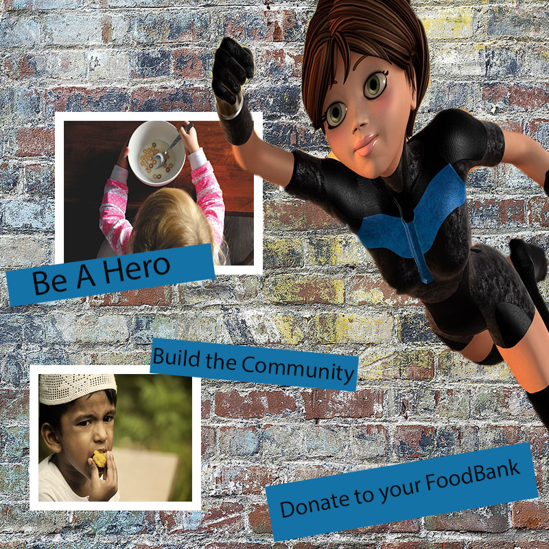
The inspiration for this process basically came from the idea of how much I love food and my willingness to incorporate it into a need for others. I wanted people to understand that though I have a love for food, there are those who rely on others to meet their dietary needs. And for that reason alone its dire that people help volunteer or donate at their local food banks. The concept in my head I thought was simple but the execution itself was somewhat difficult because I was now to physically design something on my own.
I began with the background, the brick wall symbolic because I wanted to “build”, I wanted it to be either a brick wall or construction site, which either way was hard. I needed to revert my audiences mind into thinking about food so I knew that I had to include food in settle way rather than just having a brick background. Next came the idea for the female lead if you will, I found dozens of characters but none was more perfect than the super hero that I chose. She was in the perfect position to come off the side of the presentation without taking up too much space. I knew I wanted my hero flying in from an angle rather than just in the middle of the page and she fit my idea seamlessly. I remember cropping her from her original photo wasn’t too difficult as the background was such a contrast in color compared to her, it was simple to plop her out of her environment and into my own.
As we had read before I wanted to use similarity but had to make it happen on my own, how could I bring different elements together and portray them in unison. My next step was to include children, which I surprisingly found difficult. I didn’t remember how to properly crop a photo and instead would crop my entire work. After re-watching the video about text and inserting pictures I went along with the demonstration and was able to fit the kids into my piece. I clearly wanted to use children eating to tug at the audiences heart strings a little bit but to also let them know that they’re helping children whom at times cant help themselves.
It was important that size and shape of the photos fit perfectly, so that the presentation didn’t have the audience wondering where to look next. I wanted to keep everything streamlined so that one could look at this photo and read it from the top down. Its meant to draw attention to the left hand side and read to the right hand bottom corner, this continuation is also characterized by the way the woman is positioned in the photo. She’s there to guide.
I find that this is appropriate for my intended audiences, I simply thought about what I would want to see and could it effect me? It was great to be able to think of something and within a few hours be able to create and see it visually. There are so many directions that I could’ve gone with this but I am happy with the end result and anxious but excited for critique. I believe that anything that could help me, and this image, is only made possible when others eyes are on besides my own.
https://pixabay.com/en/kid-boy-muslim-eat-eating-ramadan-635811/
https://pixabay.com/en/people-kid-child-baby-eating-2560321/
https://pixabay.com/en/super-woman-flying-3d-figure-female-1885016/

Nice poster Dae Shawn! The poster conveys your message in a very simple and easy-to-understand way that explains what the message is all about the moment a person looks at it. The big bold banner at the beginning says “Eating Again,” so that anybody that sees it will know that the poster is about providing food for people in the society. You used two different pictures of young children that are eating, which helps in conveying the intended message to the audience. Your texts are very bold and self-explanatory, so the entire poster looks very good and easy to understand. You used a photo of a super hero, which is also really nice as the poster is encouraging people to become heroes by donating food to the food banks in their community. However, I think that a picture of fresh vegetables and assorted foods would go a long way in enhancing your poster. Also, the caption “Be A Hero” could be moved closer to the picture of the hero.
LikeLiked by 1 person
Hi Dae’Shawn! I love your topic (mainly because I love food!) it’s great for a blog. I enjoyed looking over your past posts and getting to know a little bit about you and why you chose this topic. Your graphic design project draft is really good! I think the message you chose is really strong because it calls for people to act. I would suggest maybe playing with different fonts or bolding the letters to call more attention to the message. I like the images you chose, the superhero one looks great! However, since the main message here is donating to a food bank, I would suggest maybe switching out one of the other two photos to represent that. Either a photo of people donating at a food bank or the donation itself, like a pile of products people can donate. I think an image to represent the message you’re giving would really strengthen your design. Overall, I think you did a great job and I enjoyed reading the process you followed to create this design. I’m excited to see the final result!
LikeLiked by 1 person
First of all, I was very impressed by your topic. Thanks for working on something so meaningful! Great blog name, too! The mission of your Photoshop design is obvious from the text and pictures, and I am always partial to a brick background. Overall, I really like the design, but I do see a few areas that could potentially be improved. The biggest improvement that I think you could make is to add a little more unity to your design by using similar sized shapes or font. If I were you, I would choose to either make all of the text boxes the same size or crop the child photos to be the same size or use one font size. I think any one of those three actions would make the design look just a little more unified. Another improvement you could make is possibly choosing another font. This might just be a personal preference, but I think using a bolder, more unique font would really bring your poster to the next level! Great job, and I am excited to see your final draft.
LikeLiked by 1 person
Taking everything into consideration I conclude that I have a pretty strong project and the message is received well. But I’m learning that it isn’t so much about the message but about the design itself that could use further detailing to make it stronger. Vicky offered something that I didn’t think of myself and that’s to add pictures of fresh produce or perhaps items themselves that are donated rather than only having children eat. I will heavily consider that as well as Sinais’s advice to play with different fonts. For so long I’ve done projects in general with all the same font because I’m concerned my audience wouldn’t be able to read something different, but I’ve been reminded to have fun and to play a little, it can only make things more interesting. Jessica’s critique on cropping my images the same size allows me to add additional photos as well create a “unity:” that she mentioned. All of this was incredible advice and I look forward to utilizing all of it! Thanks to those who left feedback!
LikeLike