Final Project Reflection

Savior Final

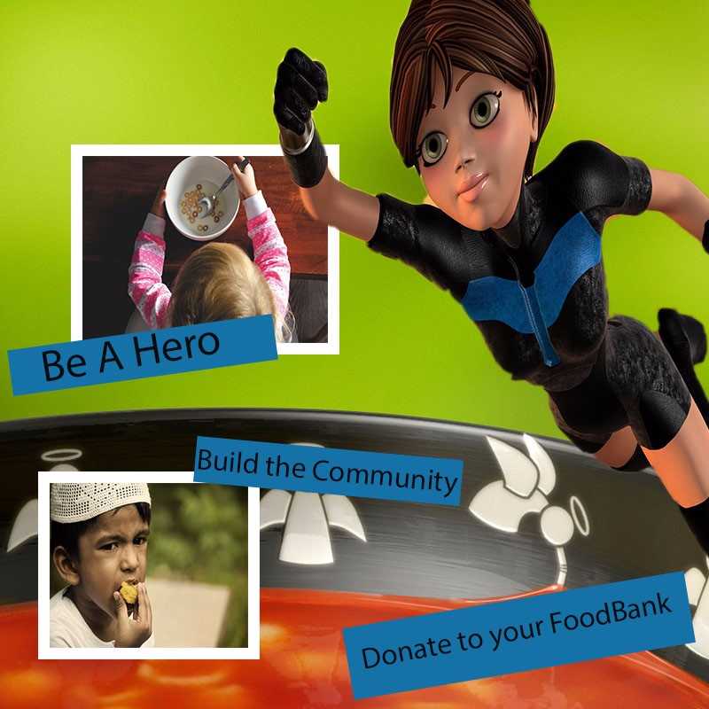
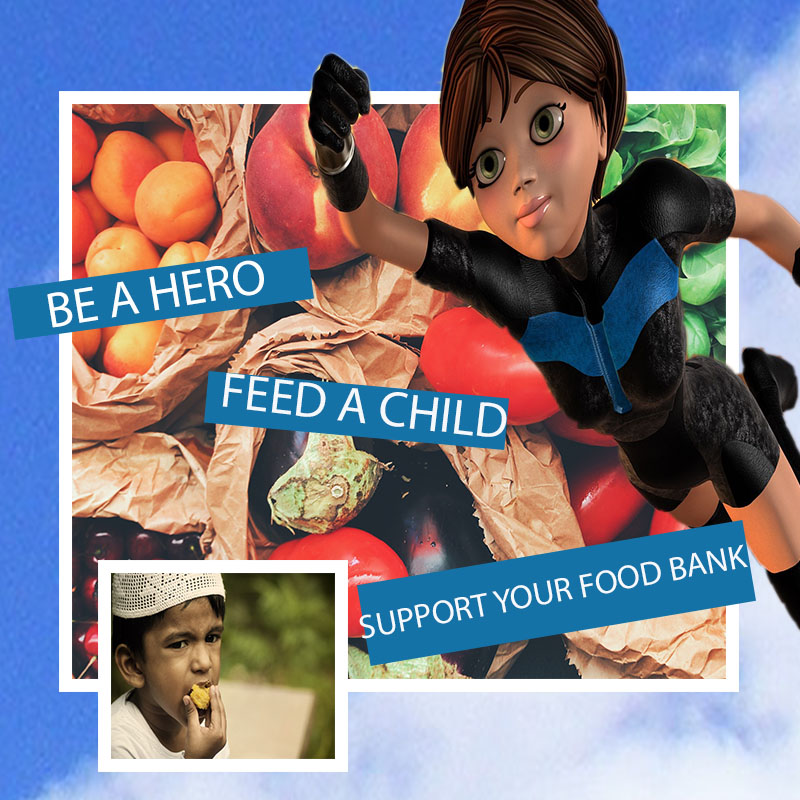
I chose to do the topic of the Photoshop because it was one of the first projects we worked on and one that had a positive message behind it. The Photoshop unit was impactful for me because I had always wanted to work within the program and found myself jealous of those that found it easy. Now I can’t look at a flyer or poster without thinking about the layers involved or which filters were used within the program to create, and gauge how easy or difficult posters and images are to make. I chose to alter the image of the super hero flying in the sky and over different food into a woman flying over a bowl of “angel soup”. I chose to alter the image this way because I like the color of the soup and the pop of color the green provides. Also because you can see little angels aligning the bowl, which made me think of being good and giving back, and like those angles we too could be angels to children in need of food. If I had to employ this project I would definitely use it as a flyer. Providing information on the back, phone number nearest food pantry, and facts about how kids could use your donation, I believe this project could have potential to be a cover a brochure possibly. My defined audience is those who want to be involved within their own communities and lend a helping hand. Specifically those in churches as they have food and clothing drives often. So this would be perfect to hand out before, during, or after a church service.

download soup

Final Bru Burger Video

I have to begin by saying that this was my favorite project thus far in the semester. It allowed me to be creative and play the role of the director, producer, and writer. Which was a lot of fun. The second time around I fixed the problem that I had with fitting the image within the frame. So all throughout the video, everything is the same size. I also played around with my transitioning throughout my interview with Tim. In addition, I trimmed up some of the clips to make it seem less choppy and that I wasn’t cutting him off completely. With the slides that were text boxes, I increased the text size and also centered all of it so that it’s not so scattered which was a critique that I received. I also allow the audience to read the text a lot longer than only a few seconds. I lengthened the time so that you can focus on the question.


You may also notice that I kept the night scene for the ending, to give the feeling that we had spent an entire day there. To do that I filmed completely new clips, going back to the restaurant to get more film and new angles. My last video, though it mentioned that I’m a burger lover, had not one burger in it. So I made sure that the burgers were the focus this time around. I also wanted a couple more shots of Cincinnati which I was able to do because it was daylight out. Overall I do note the improvements made a difference between the draft and my final. I had a blast putting this together.


Bru Burger Video Story Adobe Draft

The theme of my video of course had to do with food. I wanted to shoot something about my favorite food, so I immediately chose cheeseburgers. I knew the topic would be somewhat easy to cover as I work part time in a burger restaurant. The filming process took place during my shift. I would start by just start covering some of the dishes as they came up in the window. It was somewhat difficult because as food would come up I just wanted to film it as opposed to take it to the customer. I got a lot of great shots but although I filmed a lot of food I knew to take the film to the next level I had to interview someone. Editing and putting the project together wasn’t as time consuming as I thought it would be. It took a total of 6 hours. The hardest part was piecing everything together because once I downloaded everything into premiere it was jumbled up. I also had to film the narration separately as I knew I wanted to be talking in the background all the while showing dishes and the restaurant. So after figuring what was the beginning, middle, and end I began to put everything in order which took a lot of snipping. I also had to listen extremely carefully as there were times I would clip something out that I could’ve used. In addition there were a lot of things that I didn’t need to use. I thought I didn’t have enough film but it turned out that I had entirely way too much. But I rather have had too much material at my disposal than not enough.


My story relates to my topic because its food and it’s my passion, I once tried to deviate from the topic and a suggestion I received was, “I like when you cover food, you should do that” so I stuck to what I know best. Besides what’s a food blog with food on it? I do wish that I could’ve used a more proficient camera to capture my material, I used my iPhone which was sufficient but filming automatically had me thinking I was Steven Spielberg and immediately I began looking at quality cameras. I enjoyed this project a lot. Specifically the editing process. I found myself resorting a lot to what we learned in the tutorials, especially when it came to adding text. I wanted the viewer to interact even if it was just a little bit so I thought I’d add text boxes instead of reading questions aloud.


Overall I’m excited about how the project came out, and am really excited to get back to work on it after everyone’s feedback. This video was a great way to express myself creatively and through a medium I love most. Food! I hope you enjoy watching it as much as I had fun making it!

TIME AUDIO VISUAL
0:00 – 0:13 Introduction of Dae’s Food Blog and covering my favorite food. I also introduce BRU Burger which is the restaurant that I’m covering The shot takes place outside the doors of the restaurant
0:14 – 0:29 Is the first introduction to Tim, and his aspirations as well as letting you know that I’ll be interviewing him and talking a bit about the restaurant You get mixed shots of the food (chicken tenders and salad) as well as a shot of Tim. This intro ends on employees in the kitchen
0:30 – 0:36 I describe the vibe and the art You get a glance at the bar as well as a painting on the wall
0:37 – 0:39 I describe how busy BRU gets All the tickets are aligned up in the kitchen while the manger stands in the window overseeing
0:40 – 043 Describes the food and portion sizes in comparison to other places. You get close up shots of the fries and onion rings
0:44 – 0:47 Talks about the ketchup and how they’ve gotten famous on their in house recipe Shows a close up on the house made famous ketchup
0:48 – 0:56 I talk about the location and how its perfect location for hungry crowds looking for that perfect burger. I also give the location. I again show the manager in the back of house looking over the kitchen window. Then there is a cut to salads in the window
0:57 – 2:33 Tim and I begin the interview and I ask him a series of questions related to his restaurant experience and future culinary aspirations The interview begins with a shot of Tim and a series of questions.

·         What do you love about working at Bru Burger?

·         Have you always had a passion for food and working with the food industry?

·         So if you could open your own restaurant what style of food would you serve?

·         Do you do a lot of cooking now?

2:34 – 2:37 I begin closing the video and tell you to visit when in the Queen City You see one last shot of the inside of the restaurant.
2:38 – 2:43 You will hear clanking of dishes and people in the back eating and talking. Also may hear the chefs in the back cooking. Burgers on the blacktop. The letters “The End” appear on a plate that has a finished salad on it with a fork. The end of the dish representing also the end of the video.


Dae’s Dining DeTALES Radio (Final)


This was by far the most challenging yet rewarding project I’ve done yet. I first approached this project hesitant and not knowing if I could fully take care of the task but the second time around I knew I had to do better than my first go around. I began my recording multiple, and I mean at least a hundred samples of my voice telling my story, trying to be as clear as possible then once I had my best sample. It was time to input my work. The tricky part I found was cutting the material. Some items I would cut too short and that combined with rearranging everything, things got a little tricky. It’s amazing how you can have a conversation or tell a story with audio that was recorded in a different order than it was presented, in that way it was fun manipulating the clips. I also found finding the right music tricky.

I wanted my audio to have a radio station feel to it, like you would listen and call in to share an opinion. So I included a telephone number at the end. So in order to give it that feel I needed something that gave it that vibe, the right music was key in making the entire thing complete. All in all I’m excited on how everything came out and surprised myself with what I was capable of doing. The amount of information also played an important role, as I wanted the audience to think for themselves and solve the problem on their own without giving away too much details. Though there’s no right or wrong answer to my question, there is valid points made on both sides which I hope that I made so I didn’t seem bias. I was actually excited to find something that dealt with the food industry and had to do with something that I recently handled which happened to be people who leave bad tips.

Not everyone has served in a restaurant but those who have know what it’s like dealing with a table for 45 minutes to an hour, delivering an expensive bill only to be disrespected in the end with a puny 2 to 3 bucks. Believe me, every server has a story, so I took what I knew an applied it to this project. Again, I’m excited for how this one turned out and hope you enjoy listening to it as much as I enjoyed making it!


https://freesound.org/people/Setuniman/sounds/328177/


https://www.newyorker.com/culture/annals-of-gastronomy/the-limitations-of-american-restaurants-no-tipping-experiment

Food Blog Draft


Final Logo Design Project

Crowd-Surf-Final-PDF

After hours of deleting and starting new templates over and over again, I finally came to this design as the logo for “Crowd Surf”, which is an app not only where you can purchase tickets but also allows you to plan a night out on the town. Crowd Surf allows you set reservations at a restaurant and sends reminders of when your show starts based on your proximity to your next event, and don’t worry about driving because it also orders a car service for you according to a pre designated time. Crowd Surf is an all in one app for a perfect night out. Think of Uber meets Ticket Master, meets Grub Hub, with this app alone, all other are obsolete.
Now for the design process of my app, this was by far the toughest assignment because I was to revise something I had already fell in love with before, but with classmates input and time away from my design I decided that it was time for a fresh start. Kylie’s advice to get rid of the background couldn’t have been more helpful. My logo in all before just looked so “full” in my eyes and it was time to trim in down some, starting with the waves in the back. I also took her advice and got a new photo which makes the letters pop this time, and the waves actually play a role in the design. Ayla’s idea to look more retro came when choosing a font style, I wanted something to update it but in a retro way. The lettering for me screams “throwback”. Also the black and white background to me gave it vintage feel.
I want Barbara to know that I had a hard time relating this image itself to food so I took her advice and revamped the meaning. Her advice helped me think outside of the classroom and really allowed me to put on my entrepreneurial hat, which I wasn’t accustomed to wearing. I wanted this app to look sleek and something that you’d like to look at. Capsulizing the letters within a circle makes me feel as though this could be a button I like to press, I was on a mission to make this look ‘finger friendly’ because it is app logo. Jeannie’s advice to move the words apart was also a smart idea, I realized that not a lot of logos have the full spelling within its name and CS would be so much easier to play with, so I ran with it and ended up getting rid of a lot of clutter with the other letters.
Overall I’m incredibly proud of how things came out and rather enjoyed sitting for 5 hours creating something that I only was able to visualize in my head. Below are some sketches of where I thought I wanted to go with this idea before going to the computer. I hope you guys enjoy looking at my logo design and possibly one day using it! Thank you!

sketches


Photo by Alex Dukhanov on Unsplash


Draft Logo Project (Crowd Surf)


Crowd-Surf-Logo

I chose to do something else and go outside of the box of my usual food posts. “Crowd Surf” is a ticket provider for concerts, and any other major events that may be coming to your town. “Crowd Surf” is an app that compares ticket prices and shared the lowest price with you. I thought that the name would be clever because obviously people crowd surf at concerts but also because people also will ‘surf’ the web for the most affordable tickets. We are the place where you can find affordable fun.

The task of coming up with a logo was a lot harder than I actually thought. I spent some time sketching up what I thought may work. So one point I came up with some waves and integrating them into a crowd, then I thought about a speaker then it clicked with me, and I knew that my logo for “Crowd Surf” needed to be a surf board. At first I had the idea of stuffing the words into the board making them “crowded”. Putting the words so close together would represent the crowd. After playing around with this idea I realized and stumbled upon the idea of keeping the words together but putting them in front of the surf board instead of stuffed inside. I thought it looked cleaner and not so “childish” inside of the board with bold print. I wanted something that would look a little sleeker on a shirt or on a business card. Something that would be more appealing to people old enough to go to concerts. The picture in front of the deep dark blue waves makes clear that the image behind the words is a surf board. The font I feel also needed to match the roundness and feel of the board. I felt like the board didn’t need to come together completely also, I feel like I didn’t want to give that image away too quickly.

Choosing the colors once I felt that I had finally the design together was also complicated. It’s easy to think surfing and the first color that comes to mind is blue. Which I didn’t want to just choose the easy way out. I also wanted to choose colors that would appeal to both men and woman of all ages that go to concerts. I chose at least 50 to 60 color combinations before choose the grey and blue that I did. These best go together because the background that I chose. I wanted something to pop but not blend in totally. The blue that I settled on complimented each other well with both the thought of water and the image in the background. At first I had a bright yellow simply because it was different but in this case different wasn’t always best.

I hope you enjoy my logo and look forward to any suggestions.


Photo Credit:

Photo by YIFEI CHEN on Unsplash