
After hours of deleting and starting new templates over and over again, I finally came to this design as the logo for “Crowd Surf”, which is an app not only where you can purchase tickets but also allows you to plan a night out on the town. Crowd Surf allows you set reservations at a restaurant and sends reminders of when your show starts based on your proximity to your next event, and don’t worry about driving because it also orders a car service for you according to a pre designated time. Crowd Surf is an all in one app for a perfect night out. Think of Uber meets Ticket Master, meets Grub Hub, with this app alone, all other are obsolete.
Now for the design process of my app, this was by far the toughest assignment because I was to revise something I had already fell in love with before, but with classmates input and time away from my design I decided that it was time for a fresh start. Kylie’s advice to get rid of the background couldn’t have been more helpful. My logo in all before just looked so “full” in my eyes and it was time to trim in down some, starting with the waves in the back. I also took her advice and got a new photo which makes the letters pop this time, and the waves actually play a role in the design. Ayla’s idea to look more retro came when choosing a font style, I wanted something to update it but in a retro way. The lettering for me screams “throwback”. Also the black and white background to me gave it vintage feel.
I want Barbara to know that I had a hard time relating this image itself to food so I took her advice and revamped the meaning. Her advice helped me think outside of the classroom and really allowed me to put on my entrepreneurial hat, which I wasn’t accustomed to wearing. I wanted this app to look sleek and something that you’d like to look at. Capsulizing the letters within a circle makes me feel as though this could be a button I like to press, I was on a mission to make this look ‘finger friendly’ because it is app logo. Jeannie’s advice to move the words apart was also a smart idea, I realized that not a lot of logos have the full spelling within its name and CS would be so much easier to play with, so I ran with it and ended up getting rid of a lot of clutter with the other letters.
Overall I’m incredibly proud of how things came out and rather enjoyed sitting for 5 hours creating something that I only was able to visualize in my head. Below are some sketches of where I thought I wanted to go with this idea before going to the computer. I hope you guys enjoy looking at my logo design and possibly one day using it! Thank you!
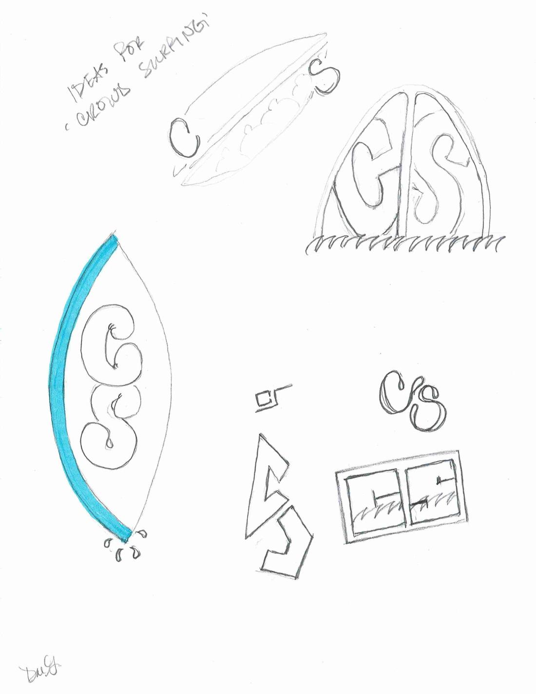
Photo by Alex Dukhanov on Unsplash
